This is a bit personal. A big motivational factor for starting my company was Ben Bergman from Multitronic Pro. Even going as far as calling me up on a regular basis and checking in on me. I had a rough time. But they’ve shown me nothing but an immense belief, care and trust in both my craft and person. Which I will always remember and respect. I think we both believe that being a good person is also good business. At least trying as best we can.
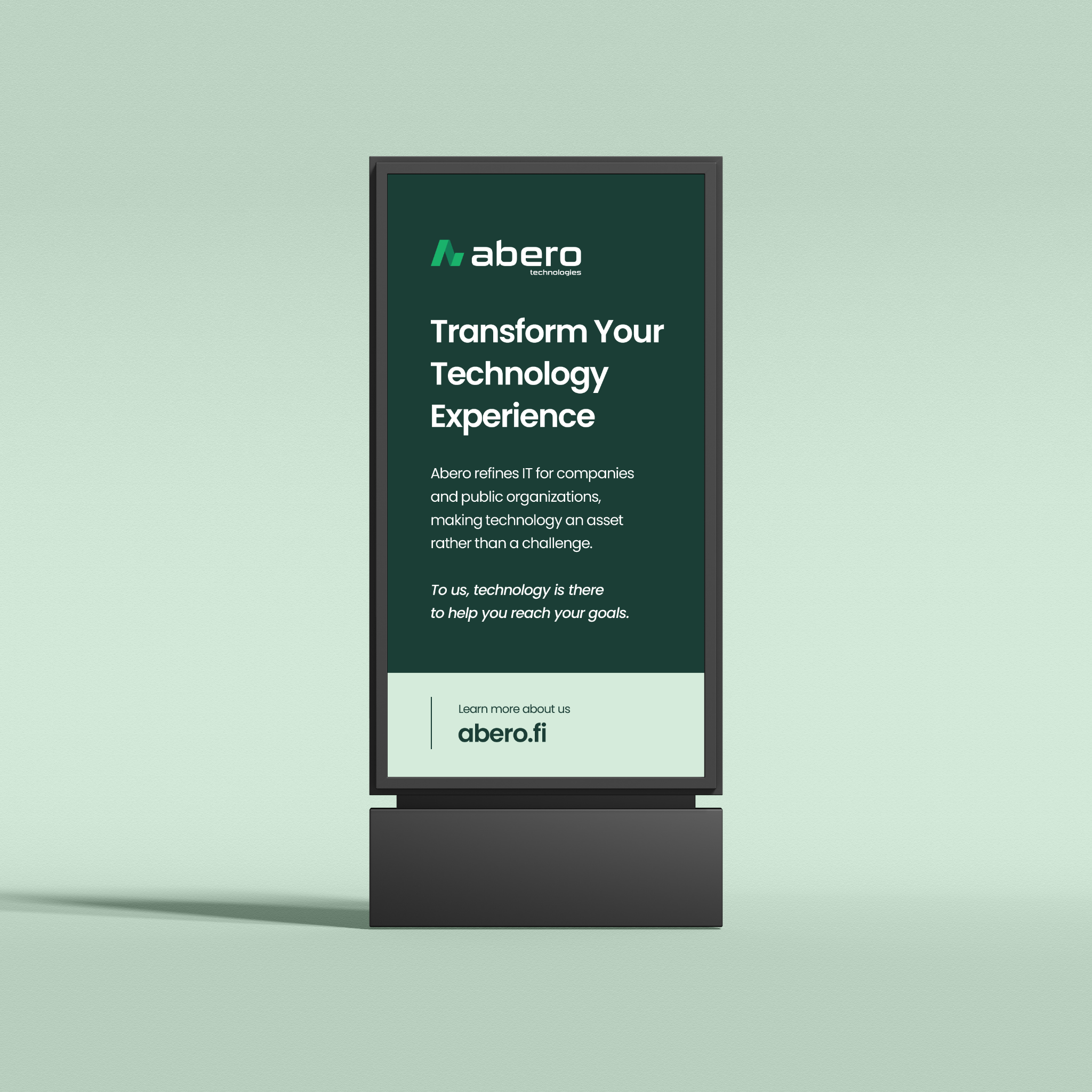
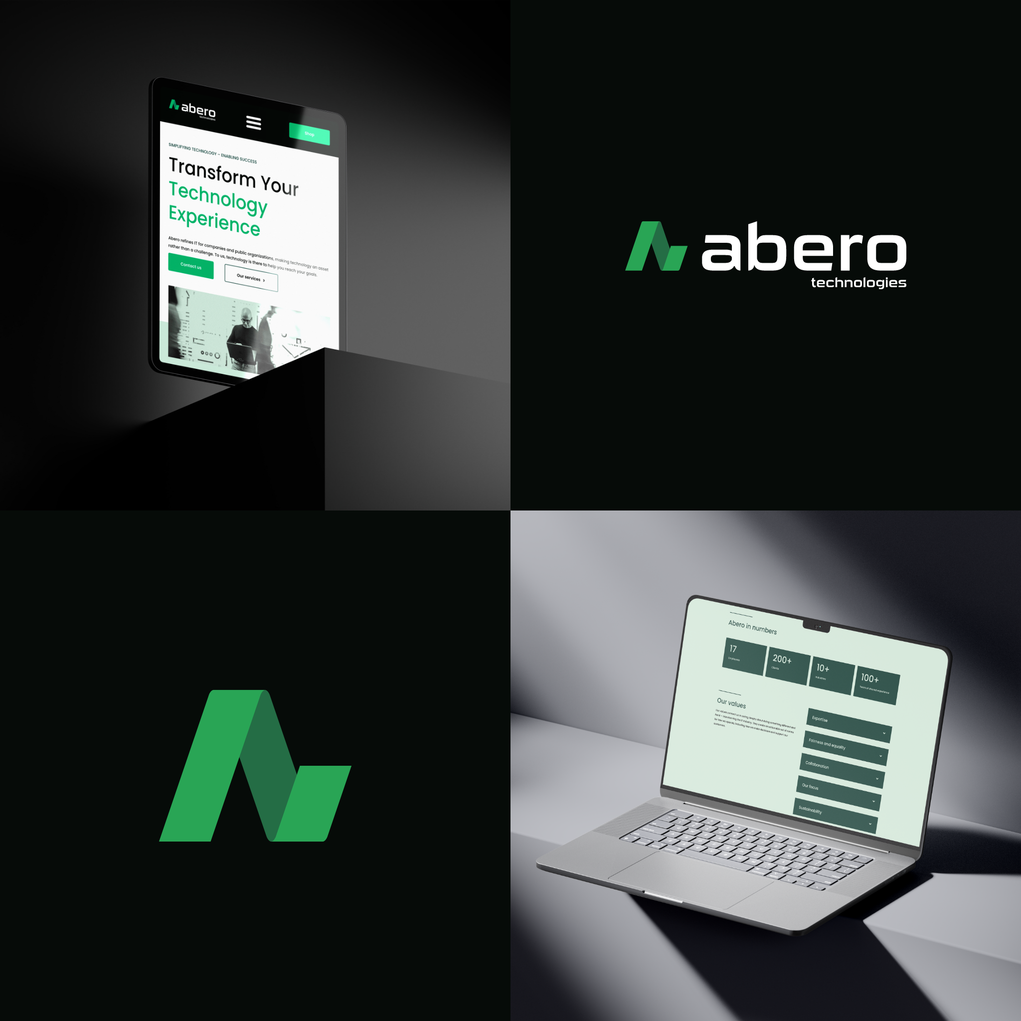
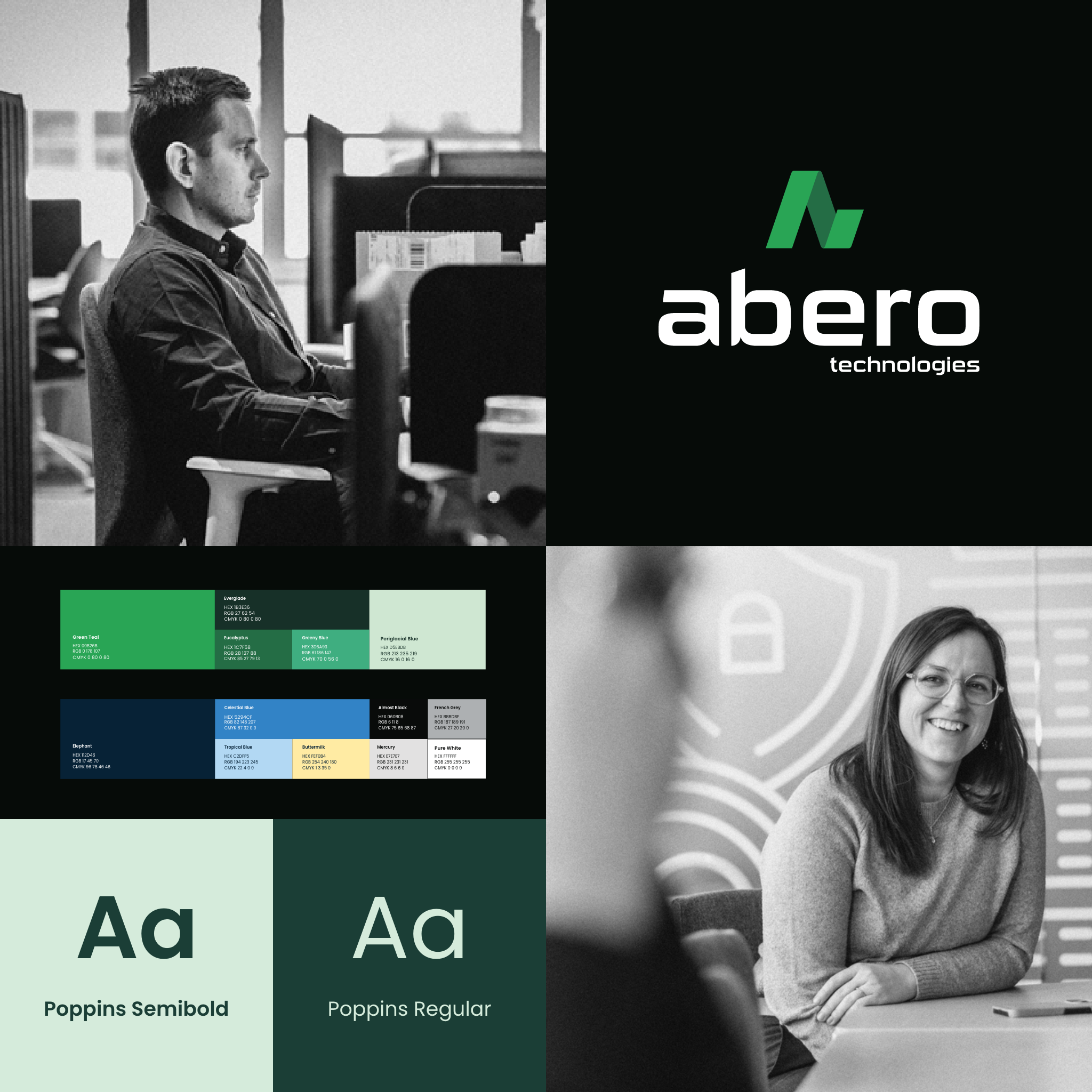
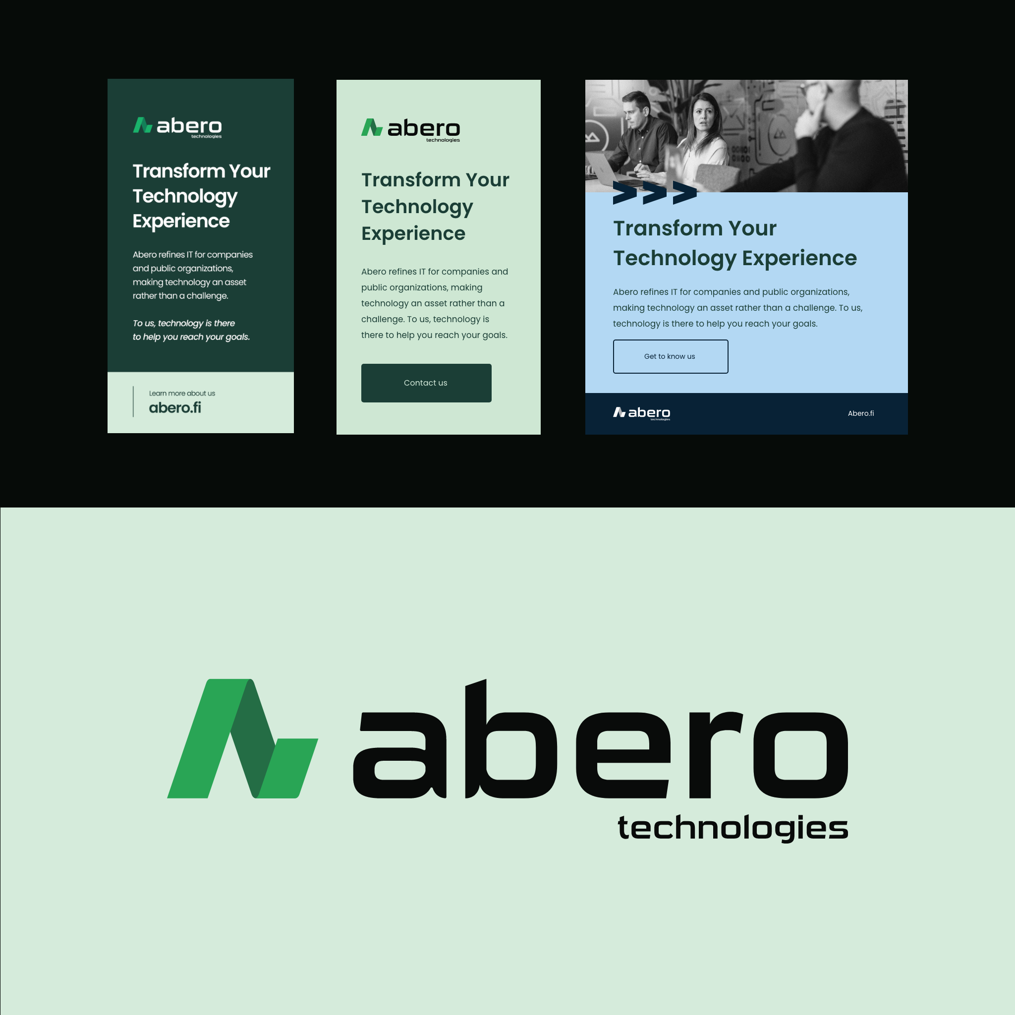
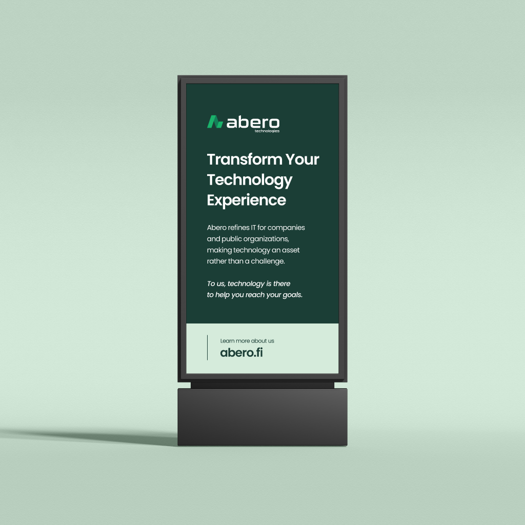
We have renewed their brand and name. They are now Abero Technologies Oy. Modern, inclusive, bold, clean and professional is the path we took. The logo icon took a while to hash out, we had four versions in total, which we all thought looked good. But we landed on the one I called “DNA” which symbolizes the letters ‘A’ and ‘B’, as in Abero, and a “arrow” pointing upwards for progress and development. Like a statistics curve. It also illustrates a cut-off strand of DNA. While working on a design a lot of times you don’t really know what you end up with. You kind of know what symbolism you need and want in it.
I also did the web design and development for their new website which can be found on Abero.fi. I wanted a clean and practical design to optimize search engines E-A-T. Did a lot of breakpoints for the responsive versions for it, so let’s hope it looks dashing in most devices. Abero Technologies Oy gave me a lot of freedom to explore this design and we are all very pleased with the outcome. The pictures were taken by Antonomia and copywriting by Genero.